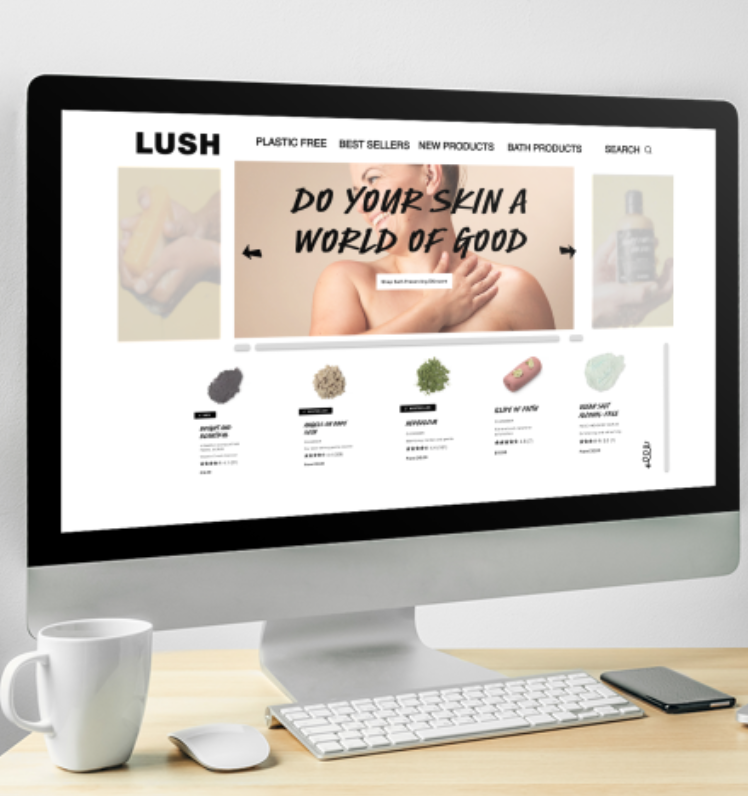
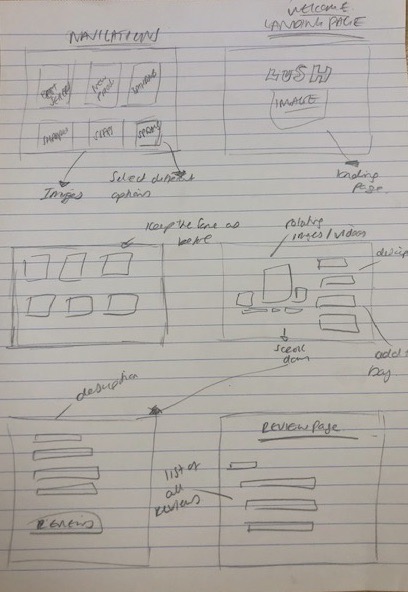
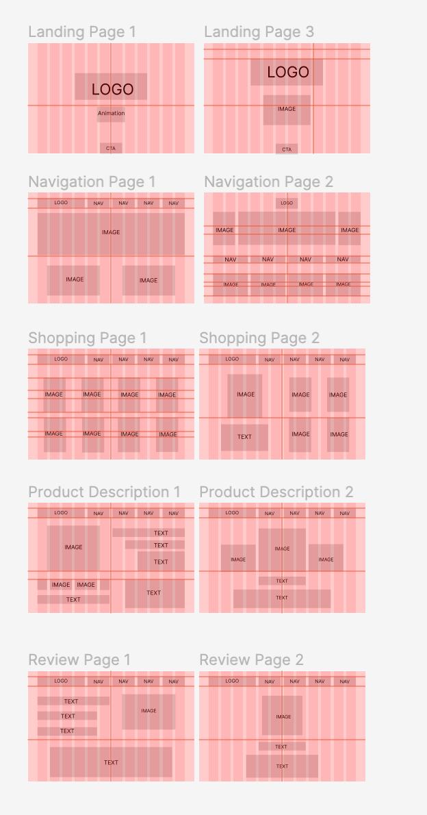
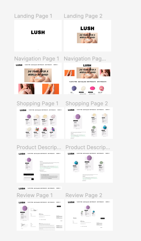
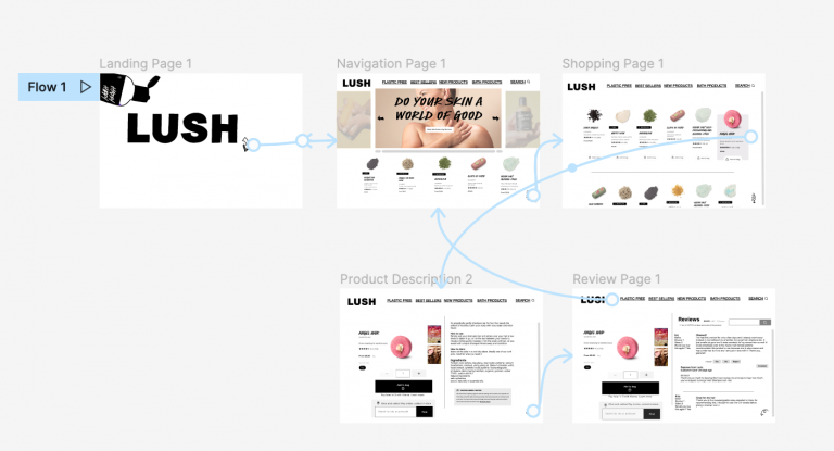
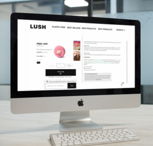
What do you think of the Redesign of the Lush website?
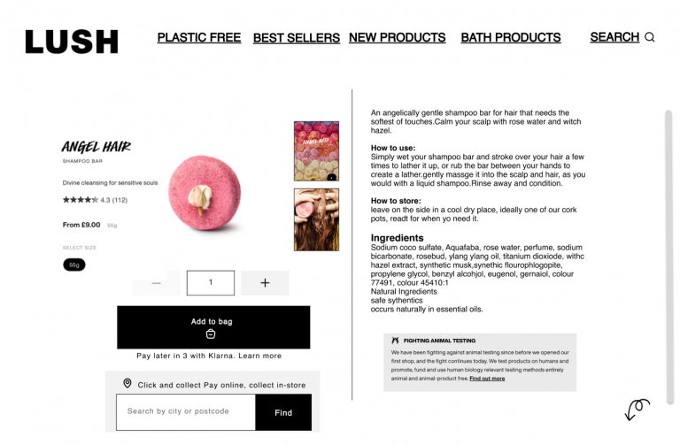
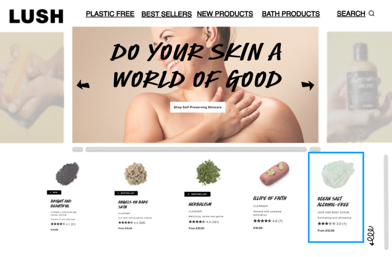
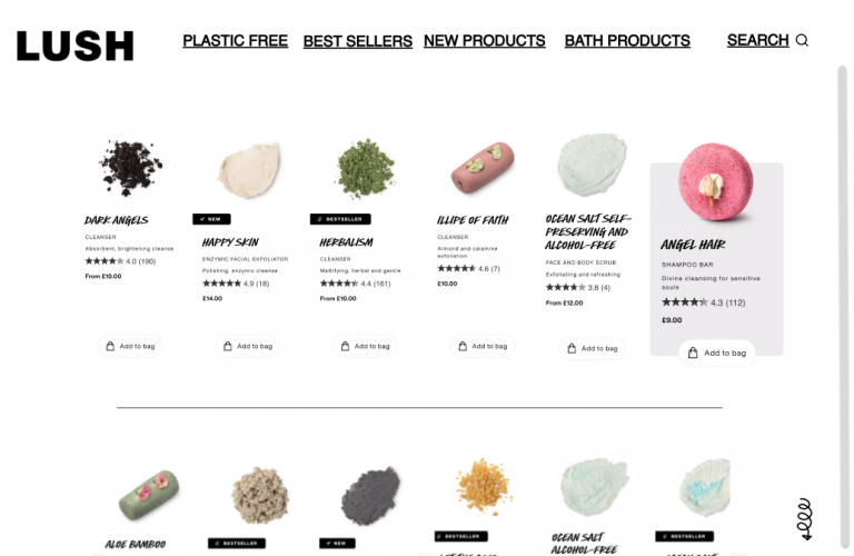
I like how simple it looks. It looks very clean.
Can you see yourself ever using this product?
Yes! it looks easy to navigate.
Was there anything surprising or unexpected about this product?
Nothing surprising. It feels like its Lush website!
Was there anything missing from this product that you expected?
I would have liked to have seen the basket page and how to navigate that.