How do you know about Fitzroy?
My daughter who has Bi-polar and autism lives in supported living accommodation in Banbury
When do you normally first use the Internet in a typical day?
Usually when I get up .I would browse my social media and check my emails .
How often do you visit the Fitzroy site, if not why?
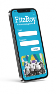
The Fitzroy website is quite new but it is improving and gives me information about what’s going on in all the different homes .As a family member I also receive a monthly newsletter.
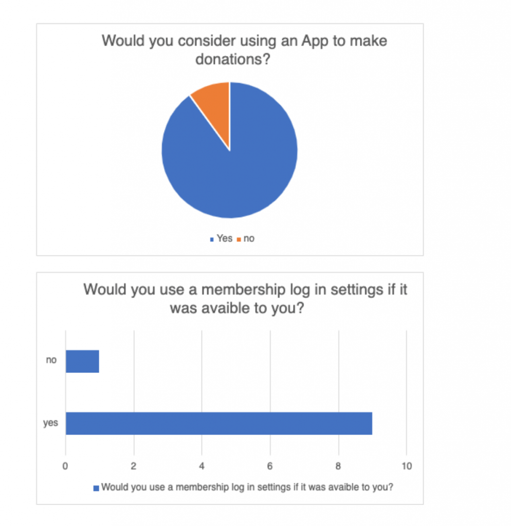
Do you currently make donations? If not why?
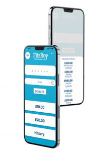
I don’t make donations to Fitzroy itself .I support my daughter. I Worry that if I donate it will go into the big Fitzroy pot and not be distributed to her home so they will benefit .
What do you like about the Fitzroy website?
It’s quite easy to use, looks great with photos of all the residents. I really enjoy hearing about all the stuff they get up to.
What is the biggest pain point?
I think it is a good website. I think I should look at it more frequently and I also think I should tell more people about Fitzroy and the good work they do.